Reducing confusion and mitigating friction are things that come to mind when thinking about presenting the optimal amount of choices for customers.
This makes sense when you consider that some customers have a hard time making decisions when flooded with choices. Presenting many similar options for the same product is usually the last thing any marketer should want to do.
It may be intuitive to think that limiting the amount of choices, buttons and text to best fit your ideal customer’s need is always the best way to go.
But, as I’ve recently learned, that’s not always the case. In today’s MarketingExperiments Blog post, I wanted to share a recent experiment that tested the effect of limiting product options within a conversion funnel.
(Editor’s Note: To protect the competitive advantage of our Research Partner, images and results have been anonymized.)
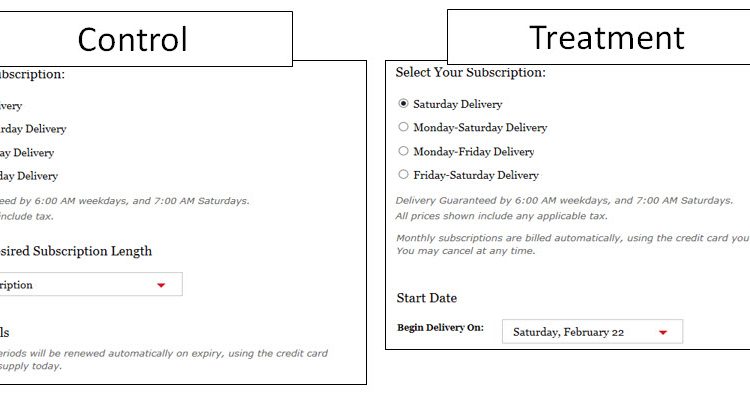
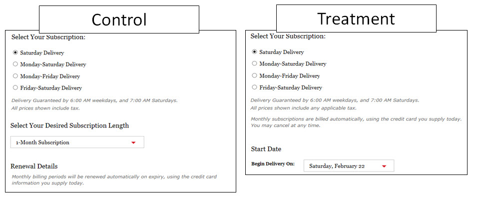
In the control, customers had the option of selecting a range of delivery options with radio buttons and a dropdown menu. Visitors to the control could choose between monthly auto-renewal, six month or one year options, while visitors to the treatment were locked into a monthly option.
For the treatment, the delivery options offered in the radio button remained the same. The only variable we changed was removing the dropdown selection of desired subscription length.
The experiment was designed to test our hypothesis that eliminating a dropdown menu that required visitors to make yet another decision would decrease friction.
Decreases in conversion are excellent teaching tools on the power of choice
The treatment experienced a decrease in conversion of nearly 40%.
By eliminating those choices, we should have decreased friction for the majority of the visitors to the funnel. What did we miss?
It’s possible that by relying on analytics, statistics, marketing intuition and company-logic, we overlooked a fundamental human behavior.
Sure, presenting a ton of options could confuse and drive away visitors.
However, people find a lot of value in the ability to compare prices and look at options they may never be truly interested in.
Dan Ariely, who spoke at MarketingSherpa Email Summit 2014, demonstrated in his “Are We in Control of Our Decisions?” TEDTalk, the presence of an undesirable or “useless” option can often make other options seem much more appealing.
The value of choice is a powerful tool in decision-making.
Marketers that constantly strive for efficiency and optimization would do well to remember that.
You may also like
E-commerce: 5-question checklist for eliminating products [More from the blogs]
Landing Page Optimization: Multi-product page increases revenue 70% [More from the blogs]
E-commerce: 3 test ideas to optimize the customer shopping experience [More from the blogs]


