Recently, I sat in on what I like to call a “meeting of the minds” – where the research team in our lab sits down to discuss their ongoing research in online marketing, and optimizes pages together. Here in the labs, we call this a Peer Review Session. So, I took notes to share their advice with you and make you feel as if you were right there with us.
While there was a lot of helpful content being discussed, I decided to share their optimization suggestions for a landing page that I got to present to them, thanks to the help of the Director of Editorial Content, Daniel Burstein. The page was from the CBS Sports Web site, and it had to do with their Fantasy Football league (I play in the ESPN league, by the way). Yea, yea. I know, the 2010 NFL season ended a couple of weeks ago, but this advice will last forever (was that too much?)
Because, while CBS Sports submitted this page for live optimization during a Web clinic about homepage optimization several months ago while football was actually in season, we thought it might be more interesting to provide optimization suggestions for what they do in the off season.
After all, many marketers have a product that has an on and off cycle. I wondered what optimization and testing ideas our researchers would have for an off-cycle product page.
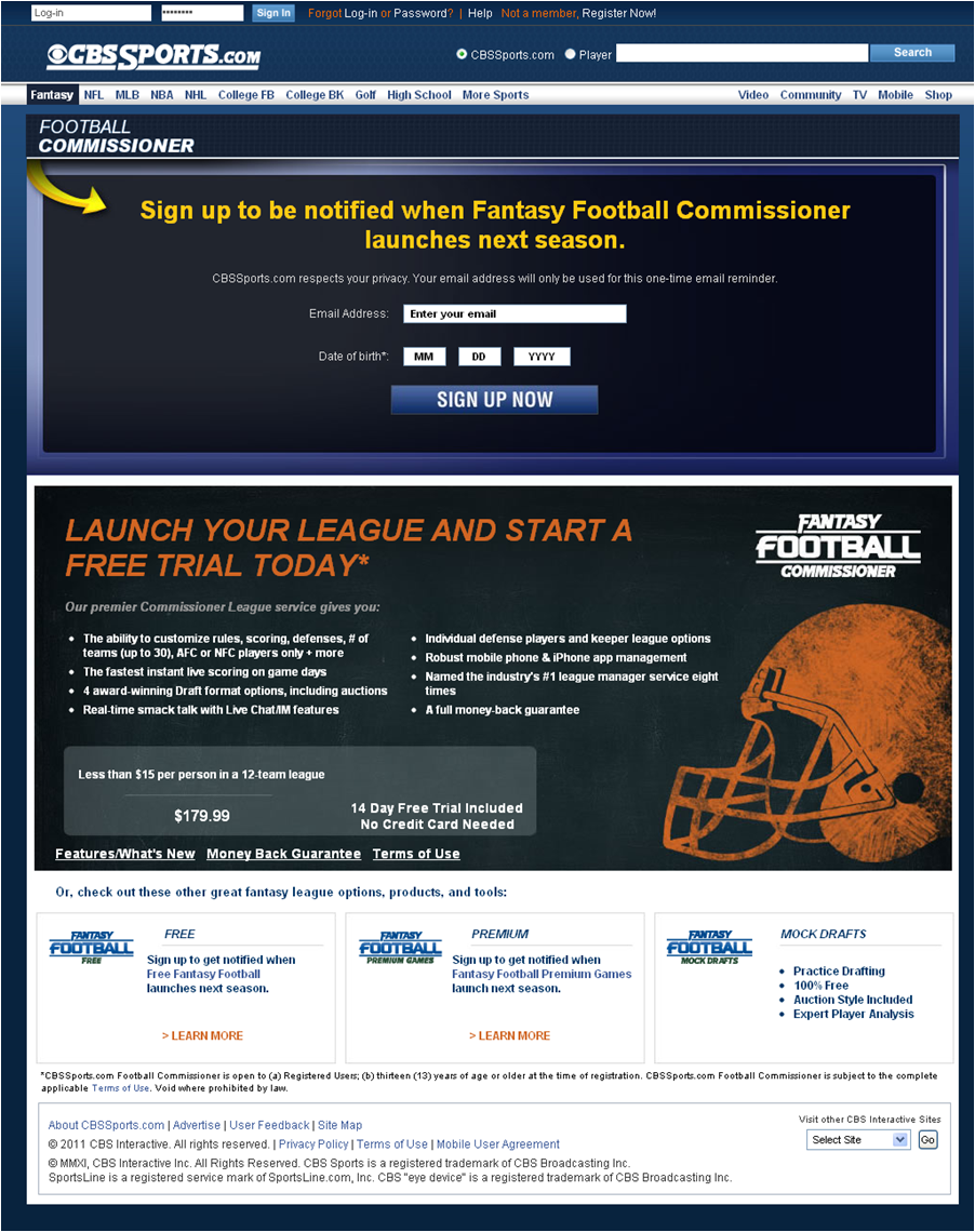
Here’s the page they reviewed:

THE GOOD
Before I go on and show you what the team (pun intended) felt this page was doing wrong, let me tell you what they did think it did right.
This page is making a push for the upcoming fantasy football season, even though the 2011 NFL season is months away (and may not even happen because of a potential lockout). When we looked at their competitors’ respective fantasy football league pages, they were either static or had no option to start planning next season’s registration early (even my beloved, ESPN league was guilty of this…Tisk, tisk).
Research Manager, Jon Powell, noted that at least CBS Sports had an interactive page and was giving potential players a reason to get engaged early and maybe even play ball (another very intended pun). The fact that they’re starting a conversation could give them a slight edge over competitors who are probably waiting for the season to get closer before making a move.
So ask yourself, if you have an off cycle product, what landing page is currently awaiting your off-cycle traffic? Are you just showing them that the last event closed? Or offering up a reason to join you for the next, future event.
THE BAD
And now, what you’ve been waiting for, the bad.
This page is a bit confusing. The problem is, it has no focus. It has two calls-to-action, making the page “conflated,” according to Jon.
On one section it’s asking you to put in your email address to get notified about next season’s launch, meanwhile, in the other it’s asking you to start a free trial. Another thing Research Analyst, Dustin Eichholt, pointed out was that the calls-to-action were flip flopped.” “Why are they asking for an email and then selling you the product?”
Exactly! A person is not going to just put in their email address all wily nilly, especially if they don’t understand what they’re being offered in the first place.
THE SOLUTION (WHICH ISN’T UGLY AT ALL)
Step 1: Focus on one main objective
So, in a unanimous decision, everyone agreed that the page needed to be focused on one main objective. The research team’s suggestion was to get rid of the section that asked you to start a free trial and remove pricing all together.
But wait! You might be asking yourself, “isn’t the objective to sell a product?” Yes! But, you can’t sell something without first starting a conversation with the visitor and showing them why it’s valuable to them. The objective here should be to start up an email nurturing campaign. Especially, considering this page is trying to pre-sell.
So, CBS Sports has more than enough time to get the potential gamer interested by showing them over time why they’re the best fantasy football option for them. You show them price in the emails. But, I won’t go into depth with that, because we’re still trying to optimize the landing page and get people interested. Email campaign stuff comes after engaging the visitor.
Step 2: Find the differentiator
So, now that we have a clear objective, what’s the next step? Senior Director of Sciences, Bob Kemper, said they needed to express their value proposition, which is essential in online marketing. Clearly show the audience the value of the product through a quantifiable statement.
Your value proposition should be you conversation starter and show the visitor what makes your product their best option. This is especially important for CBS Sports’ fantasy football league, the only online fantasy football league that isn’t free (according to our limited research of visiting three sites)!
So, they need to really express the “differentiator” as Bob said during the meeting. Senior Optimization Manager, Adam Lapp, (who happens to play fantasy football using CBS Sports) mentioned they had some great features, which they had buried all the way at the bottom of the page – where the free trial section is. He suggested they move those up to show visitors the product quality. Those features can support your value proposition and make your product more enticing. But remember, you’re not selling the product just yet, you’re getting the visitor pumped about your league and getting them interested.
Step 3: Capture the email address
So, you’ve focused your page objective, have expressed your value prop and got the visitor a little interested in your product. How do you drive in for the touchdown and get that email address?
Time to optimize that form field! People get anxious when it comes to putting in their email address, because they think you’re going to spam them ‘til they go crazy. So, as our Managing Director/CEO, Dr. Flint McGlaughlin says, you need to show the visitor that the offer is worth the risk of putting in their email address.
How do you do that? Simple, offer something. You don’t want to come off as if you’re just trying to get their email address. In this case our research team had a few incentives CBS Sports could try.
- A free preview guide for the upcoming season for all those potential commissioners who sign up early to get information about the league. Trust me, fantasy football players love that stuff!
- An exclusive top players draft list for the potential commissioners, (the first year I started playing fantasy football, I probably would have given up my first born for that list. I kid, I kid. I don’t even have a child, but yea, I definitely would have been interested in that list of top prospects.)
- Another nice incentive that Adam suggested was offering those potential commissioners an exclusive 20% discount just for signing up early and reserving their spot. That discount could be used if they finally do decide to register for the league that season.
The next way to optimize that form field is changing the look a bit. One thing Adam suggested was changing the birth date section to a pre-selected “Yes, I am 18 years or older” line. It takes away the hassle of having to type in your date of birth to confirm you are the appropriate age to use that product. Remember, you want to make the process as smooth as possible for the visitor.
My two cents on that form field would be changing the call to action from the current, “sign up now,” to something like, “Get in the game now,” “Reserve your spot now,” or “Get an early start.” Obviously it would have to be a phrase that complements the incentive. I think that would get me more pumped about signing up than what’s currently there.
Well that’s it for my notes! I hope these tips helped you. I will make sure to take notes at my next infiltration of a “MECLABS meeting of the minds” and bring you some more insight.
(Now that you’ve read our two cents, I welcome you to use the comments section and tell us what you would do to optimize this page!)
Related Resources
Landing Page Optimization: Identifying friction to increase conversion and get a Nobel Prize
Landing Page Testing: Designing and prioritizing experiments
Internet Marketing: Optimizing form fields to maximize conversions


