Do you think your value proposition is powerful? Would your prospects agree?
Most of the time, when we ask companies about their value proposition, we hear a description of their business model. But that’s not what most customers care about.
Customers not only want to know “What’s in it for me?” but “Why buy from you?”
This is an area that even seasoned marketers have trouble with, because there is so much confusion about what makes a value proposition effective – including how to find one in the first place.
Because value propositions are so important to conversion, making a few small but crucial changes can have a big impact across all of your marketing efforts.
During our September 24, 2008 clinic, we examined why value propositions are so vital to results, presented several ways to significantly improve your value proposition, and reviewed three examples from our workshop participants who optimized their pages with a greater emphasis on these areas.
Value Proposition Problems That Hold Marketers Back:
Value propositions can be intimidating because they strive to combine small size — often 10 words or less — with a lot of substance. After all, those 10 words are supposed to convey the unique qualities of your company and/or products and services.
No wonder marketers tend to shy away from one of the strongest and lowest cost optimization strategies: re-crafting their value proposition.
Our research shows that most marketers have trouble with the following areas:
- Company has not identified a value proposition
- Company does not clearly express its value proposition
- Company is not testing or measuring its value proposition
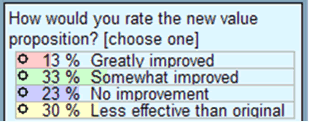
These three problems can feed on each other, creating a negative cycle that hurts ROI. In fact, the majority of the 487 marketers we polled during the web clinic said they struggled with all three issues (see poll results).
Key point: To counter these issues, your optimization strategy must include a continuous process of identifying, testing, and expressing value propositions effectively.
Value Propositions: A Major Key to Conversion
What exactly is your value proposition? The primary reason a prospect should buy from you.
When we review the MarketingExperiments Conversion Sequence, it’s easy to see why getting your value proposition right should be a top priority.
Where C = Conversion, the other sequence elements refer to:
- m – the match between the offer and visitor Motivation.
- v – the clarity of the Value Proposition.
- i – Incentives used to counter Friction.
- f – the level of Friction in the sales process.
- a – Anxiety caused by the process.
While Motivation has the highest coefficient in this formula, it also represents an external factor in the marketing cycle that is beyond your control. That makes the clarity of your Value Proposition the most important internal factor.
However, many marketers try to improve results by changing page elements like font colors and sizes, button shapes, images, incentives, and so on, when the first step should really be focusing on strengthening their value propositions.
Let’s look at a real example.
Example #1: Down & Feather Company
Original Homepage (Detail)
David Smith submitted his site’s homepage for our live optimization web clinic on PPC campaigns in May. He also attended our Landing Page Optimization Workshop in June and worked with our team on ideas for improving the site.
Can you find the value proposition in the original homepage below? Most clinic participants could not.
This is the original value proposition that David submitted for the clinic:
“We don’t harm the birds to acquire the down and we allow our customers the ability to have their pillow firmness adjusted for one year from the date of purchase for FREE. No one else in the industry provides such service. Pillows are very personal and difficult enough to select at a big box retailer much less over the Internet sight unseen. Quite simply the finest down bedding in the world.”
This example underscores the importance of identifying your true value proposition before trying to communicate it. The original homepage did not communicate the stated ideas adequately, much less emphasize them.
The truly unique features of David’s value proposition were buried in a long, complex sentence that probably was skipped over by most visitors. And the customized pillow policy (the true value proposition) was not expressed on the original homepage at all.
However, although the redesigned homepage is still a work in progress, it now puts the primary value proposition in the spotlight.
Redesigned Homepage (Detail)
Key differences in how the value proposition is now expressed include:
- The company’s real value proposition – its “Perfect Pillow Policy” – is now clearly articulated and showcased in a prominent banner on every page.
- “Always Free Shipping” is emphasized (red, placed higher on page), while the credit card and BBB logos are gone from masthead.
- Customer Care section in left navbar reiterates value points.
Comparison: Before and After
While the redesigned page could benefit from further optimization, David confirms that adding and emphasizing the revised value proposition has been a significant factor in improving the site’s conversion rate.
Before we reveal those results, let’s review the essential characteristics of strong value propositions.
Characteristics of Strong Value Propositions
- You must differentiate your offer from your competitors’ offers.
- You may match a competitor on every dimension of value except one.
- You need to excel in at least one element of value.
- In this way you become the best choice for your optimum customer.
- There is a difference between the value proposition for your company and your product. You must address both.
Crafting a value proposition requires substantial reflection on what is unique about your company and your products and services.
Challenge: If you had just 10 words to describe why people should buy from your company instead of another’s, what would you communicate?
Step One: Identifying an Effective Value Proposition
To rate the quality and uniqueness of value propositions, MarketingExperiments uses this 1-5 scale:
- Limited value to a small market. Extensive competition and/or few barriers to entry.
- Substantial value to a medium-sized market. Limited competition and/or significant barriers to entry.
- A product or service with strong product differentiation, but little competitive protection.
- A unique product or service that is highly valuable to a large market, and strong competitive protection and/or extensive barriers to entry. This may take the form of a registered patent or limited access to product components.
- A unique product or service that is highly valuable to a large market, and exclusive or near-exclusive control of essential product components. This may also include a registered patent.
If your value proposition does not rank as a 3 or better on the 1-5 scale, you should take a critical look at your core business to re-craft a value proposition that accurately reflects your capabilities.
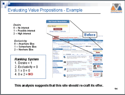
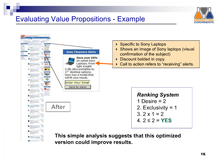
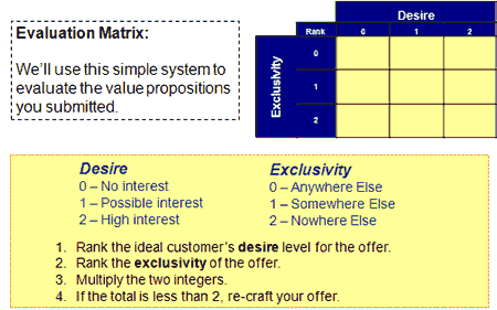
Our team also developed a simple system for ranking value propositions to approximate the potential appeal of an offer:
Evaluating Value Propositions

| Desire | Exclusivity |
| 0 – Anywhere Else | 0 – No interest |
| 1 – Somewhere Else | 1 – Possible interest |
| 2 – Nowhere Else | 2 – High interest |
- Rank the ideal customer’s desire level for the offer.
- Rank the exclusivity of the offer.
- Multiply the two integers.
- If the total is less than 2, re-craft your offer.
Evaluating Value Propositions–Example (Before and After)
Step Two: Expressing Your Value Proposition
Having a powerful value proposition is not enough; it must be communicated effectively to achieve optimal results.
First, you need to refine your value proposition until you can articulate it in a single, instantly credible sentence.
When that is accomplished, you can optimize your pages to express and support the value proposition using congruence.
What is congruence? It refers to having every element of your page either state or support the value proposition
Let’s look at two other examples from workshop attendees to illustrate the concept of congruence:
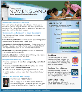
Example #2: University of New England
Original Landing Page (Detail)
Matt Celano also attended our Landing Page Optimization Workshop in June and worked with our team on ideas for revising this landing page.
Before showing the revised page, we asked clinic participants to identify the value proposition. Here are some of the more common responses:
- “On-line degree?”
- “Too much text on the page to find it.”
- “Master’s programs”
- “Concentration relevant to your classroom.”
Optimized Version (Detail)
Key differences in how the value proposition is now expressed include:
- Stronger intro copy. Descriptive subheads do a better job of expressing the value proposition.
- Cleaner masthead image conveys end result of the degree, rather than features of the campus (not relevant for online coursework)
- Prominent credibility indicators (US News rank and badge) support the value proposition.
Example #3: Co-BrandNews.com
Original Landing Page (Detail)
Eric Stevenson submitted this page for our February web clinic. He later applied several of the recommendations from our optimization team.
Before showing the revised page, we asked clinic participants to identify the value proposition. Here are some of the more common responses:
- “News your way.”
- “Add Co-Brand and increase web traffic”
- “Sign-up to add Co-Brand News to your website for free.”
- “Give your website the personal attention it needs.”
Optimized Version (Detail)
Key differences in how the value proposition is now expressed include:
- Cleaner copy throughout the page, starting with the standout headline
- Subheads, bullet points, calls to action–all work together to support the value proposition
- Testimonial addresses flexibility, customization–a key value point
- Free offer emphasized
David, Matt and Eric all used congruence to revise their copy and design elements, and present a more direct message focused on the uniqueness and credibility of their value proposition.
As clinic attendees pointed out, some value propositions were already in there, but not fully expressed. Sometimes re-crafting a value proposition is simply a matter of reorganizing the information already expressed.
Step Three: Testing Your Value Proposition
However hard you work on expressing your value proposition, to know its true effectiveness you must test to see how it resonates with your ideal prospect.
Two methods to consider are micro-testing and radical redesign testing.
Micro-testing Your Value Proposition
To discover language that best expresses your value proposition, you can micro-test using PPC ads. In a sense, micro-testing is a preliminary test to determine whether your new value proposition is clearly identified and expressed.
With micro-testing, you can explore whether your re-crafted value proposition merits a radical redesign of your pages or if you must re-engage with the processes of identification and expression.
Create 3-5 variations of PPC ads using your summary value proposition and measure the clickthrough rate of each ad. The ad with the highest clickthrough rate identifies the value proposition that’s most appealing to potential customers.
Example: Value proposition micro-test for an ISO Business:
“Radical Redesign” Testing of Value Propositions
If your landing pages or sites have limited traffic, testing the application of your value proposition with congruence using single-factorial methods (A/B tests) can be time-consuming and cumbersome.
One way to counter this is by using radical redesign tests to achieve initial results quickly, and point out specific areas for additional tests.
The three landing page examples above from our workshops and clinics have all used a radical redesign (multivariable) testing strategy.
Due to the nature of these tests, it is impossible to isolate and attribute all gains or losses specifically to the value proposition alone. However, optimizing pages with a focus on congruence and effectively expressing a more powerful value proposition is a major factor, as indicated by the conversion sequence.
With that caveat in mind, let’s look at the results of the three pages that were optimized and tested using the radical redesign approach.
Results: Before and After
The optimized version of this page increased conversion rate by 145%.(David Smith, Down & Feather Company)
The optimized version of this page increased conversions by 300% and conversion rate by 81%. (Matt Celano, Compass Knowledge Group)
The optimized version of this page increased conversions by 200% and conversion rate by 69%. (Eric Stevenson, Co-Brand News)
How These Tests Work Together
While micro-testing with PPC ads can help you find the language that best expresses your value proposition, radical redesign testing can help you optimize pages for congruence and achieve initial results quickly, while pointing to specific areas for additional testing.
In other words, these two tests can help you focus on using your value proposition to give customers the right support at the right time.
Summary
- Your value proposition is the primary reason a prospect should buy from you.
- Optimizing value propositions is a continual process that involves identifying, expressing, and testing/measuring.
- To express your value proposition effectively, pay attention to congruence.
- Micro-testing with PPC ads can help you find the language that best expresses your value proposition.
- Radical redesign tests can achieve initial results quickly, and identify areas for additional testing.
Value Propositions in the Field: How to apply the value proposition methodology to your own pages
The essence of a strong value proposition lies in its ability to answer this crucial question: “If I’m your ideal customer, why should I buy from you instead of a competitor?”
Key Point: Clarity of Value Proposition (v) is the most important internal factor in the Conversion Sequence.
Your value proposition is critical to conversion because it’s your expression of the primary reason your ideal prospect should buy from you. In the MarketingExperiments Conversion Sequence, the clarity of the value proposition (denoted by “v”) is the most important element you can control. As a result, even small but significant changes to this area can yield major increases, as we covered in Part I.
The Value Proposition Assessment Matrix
Of course, identifying your ideal customer and understanding customer motivations are the enduring mysteries of marketing. In addition, marketers sometimes lose sight of customer perspective in the face of their own pressing goals. Using the value proposition evaluation matrix can help you assess how effectively your value proposition aligns with the needs of your ideal customers.
This matrix allows you to rate your value propositions on a simple numerical scale using the criteria of desire and exclusivity. With that score, you can quickly evaluate how the value proposition stacks up against the two most significant components of customer motivation. This research brief also includes examples to illustrate how this matrix is applied.
Micro-Testing Your Value Proposition
When crafting a value proposition, using simple testing methods can further sharpen its effectiveness.
Even though value propositions are supposed to be simple, credible sentences, they can often devolve into ponderous, hard-to-read missives. Micro-testing your value proposition challenges you to pare down excess and get to the core.
Using PPC ads is a straightforward way to evaluate your language and refine it to maximum capability.
How to Micro-test:
- Create 3-5 variations of PPC ads using elements of your value proposition
- Measure the clickthrough rate of each ad
The Result:
- The ad with the highest clickthrough rate identifies the value proposition that’s most appealing to potential customers.
Example: Value proposition micro-test for an ISO business:
One benefit of micro-testing is that it allows you to craft variations of your value proposition that will be appropriate for different audiences.
But, regardless of your audience, there’s a consistent process to developing a value proposition.
Review: Three Steps Toward Strong Value Propositions
- Step 1: Identify
- Determine the primary reason a prospect should buy from you, with an emphasis on differentiation and desirability.
- Step 2: Express
- Refine your value proposition until you can express it in a single, instantly credible sentence.
- Step 3: Test and Refine
- Use micro-testing to evaluate and refine your value proposition.
- Think of optimizing your value proposition as part of a continuously evolving cycle rather than a one-off process. This will give you an advantage in the constant flow of business changes such as new products and services, different offers and tests, and shifts in customers’ needs.
Five Examples of Value Propositions
To demonstrate the concept of strong and weak value propositions, we devoted much of the Part II clinic to reviewing real pages and copy that had been submitted by our audience.
With the following five examples, we assessed the value propositions using the aforementioned matrix, and also considered how well they answered the “Why should I buy from you?” question.
Example 1: Jewelry Days
Value propositions are often confused with taglines or slogans. It’s easy to see why: Eager to promote the virtues of a company or product, the copywriter may latch onto a catchy phrase designed to elicit a positive emotional response from customers. Unfortunately, such language rarely matches the key questions customers have when they first arrive at a site, such as “Where am I?” and “What can I do here?”
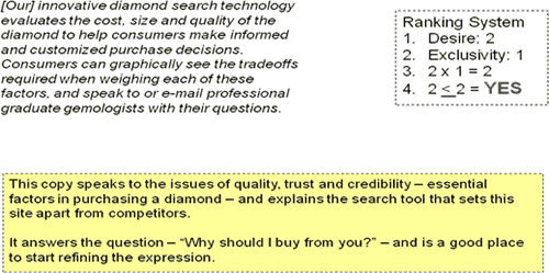
Jewelry Days’ homepage offers a clear example of a tagline.
Being able to say, “My Life is Beautiful” certainly may appeal to Jewelry Days’ ideal customer. However, “My Life is Beautiful” is not a coherent response to the question, “If I’m your ideal prospect, why should I buy from you instead of a competitor?” At first glance, Jewelry Days does not appear to have a value proposition.
But further research into their site uncovered valuable information on their “About Us” page.
From the “About Us” page:
Product quality and being able to trust the seller are pressing issues for people shopping online – especially so for diamonds. If this site’s search functionality and customer assistance claims are accurate, this site has a distinct advantage it can promote, and a clear benefit in that the site helps buyers make informed decisions. While this paragraph could still be improved, it’s already establishing a connection with the ideal customer and doing so in a way that “My Life Is Beautiful” simply cannot match.
A tagline may make you feel an emotion but it doesn’t help you make a buying decision. A strong value proposition can engage a customer emotionally and intellectually because it answers the question of why a customer should buy from you.
Example 2: Stratasys FDM
Here at MarketingExperiments, we don’t often purchase production-grade thermoplastics, so we can’t claim to be the ideal customer for these products. However, what makes Stratasys’ value proposition so effective for its intended audience is the combination of specific, credible claims and benefits – expressed in straightforward language, not puffery – and not trying to do too much with one block of copy.
Compelling case studies, which use the same combination of specificity and credibility, also help Stratasys express its value proposition throughout its site. For instance, on the homepage, prospects can see themselves and their business challenges reflected in the people-driven case studies that also serve as powerful testimonials. The overall effect is one that achieves a high matrix score and answers the “why buy” question effectively.
[Editor’s Note: This entry was also the winner of our value proposition contest. Congratulations to Stratasys and Brandyn Anderson for entering the competition. The prize: Free passes for our March 2009 Landing Page Optimization Workshop in Miami, Florida.]
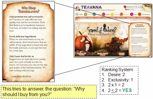
Example 3: Teavana
Teavana’s homepage represents a common middle ground: The sidebar on the page touches on factors that would differentiate the company and its products, yet the supporting language lacks the emphasis to drive those points home.
Restating the essential question of the value proposition in a heading is a smart move. It draws attention to information that will help shoppers make a buying decision. But the subheads are vague compared to phrases such as, “Every ingredient is hand-selected for health and taste” or “Bagged teas are typically lower quality … We hide nothing with tea bags.”
Many websites sell tea and use the same language found in the subheads – “only premium teas” and “fresh, delicious ingredients” – making the expressed value proposition fade into this crowded market rather than standing out. While the elements of a good value proposition are in the sidebar, and yield a good matrix score, much could be done to improve the expression, from the copy and its call to action, to its placement on the page relevant to the other design elements.
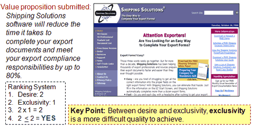
Example 4: Shipping Solutions
This is another almost-but-not-quite-there example. Shipping Solutions’ strong quantitative expression gets lost in grammatical confusion and poor copy congruence.
In the submitted value proposition, Shipping Solutions presumably intends to promise an up to 80% reduction in time to complete export documents while helping to meet your compliance responsibilities in full. We’re not the target customer for these services, but we wouldn’t expect an 80% compliance rate to be the best selling point.
Just by altering this sentence to clarify what the “up to 80%” does, and doesn’t, apply to would be a step in the right direction. If that reduction is the industry leader for this market, even better.
The “About Us” page mentions that this is the #1 selling software of its kind in the U.S. If that claim that can be fully substantiated with credibility indicators, it deserves to be more prominent and supported with awards or reviews. Moreover, the submitted statement is not closely tied to the language presented on the page, which emphasizes “easy” several times but doesn’t specifically underscore the huge time savings. An alternative would be to state a clarified value proposition immediately and directly while supporting the claim to exclusivity through a comparison chart.
Example 5: 1-800-Bakery
1-800-Bakery expresses its current value proposition by noting the years of experience and on-time delivery. But are those terms really the most effective when you’re looking for a bakery online?
On-time delivery is certainly important, but many competitors can deliver that. Likewise, claiming 25 years of experience is good, but numerous bakeries can match or exceed that, and may not even need to (like a celebrity chef’s brand-new bakery or a younger business with a wildly popular recipe). All in all, the submitted value proposition does little to distinguish the site from a wide range of competitors.
Fortunately, much like Jewelry Days and Teavana, the components of a more unique value proposition can be found around the site. At the bottom of the home page, a personal note from Chef Steve uses compelling points such as: “more than 800 fresh bakery treats from 53 bakeries across the United States” and that every order “goes straight from the local baker’s oven to the doorstep where you ordered it.” Another page on the site states: “We use tested and known bakeries to form an online family of bakeries who have committed to a proprietary code of excellence.”
This type of precise, quantitative information about variety and the network of local bakeries, plus the quality standards and freshness, would likely answer shoppers’ questions of why 1-800-Bakery is their best choice.
The “Buried Treasure” Effect
Four of the five examples above illustrate the “buried treasure” effect: Your strongest value proposition is often hidden in your copy or on your site.
Between desire and exclusivity, exclusivity is almost always the more difficult quality to achieve. That’s why marketers must uncover what truly differentiates their offer, or risk squandering key advantages.
To pinpoint qualities that differentiate your organization, review pages beyond homepage – About Us, FAQ, Help, even Careers – for hidden gems that deserve more prominence.
Live Optimization: Review of Revisions by Part I Participants
We began our live optimization session by reviewing value propositions that had been submitted by clinic participants for Part I, and were then revised (either the copy or landing page) before Part II.
For more feedback on the effectiveness of the textual revisions, we also polled our clinic audience for their reaction to the changes.
Copy Revision 1: JMR Consulting
First Value Proposition Submitted:
We do marketing and public relations that works for small software companies.
Revised Value Proposition:
Get your own team of software marketing experts to help you grow your small software business starting at just $2000/month.
The Audience Poll:
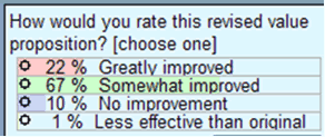
Most of the audience rated the revision as an improvement but the overall response was lukewarm. Jimmy Ellis and Aaron Rosenthal offered suggestions for further development.
Jimmy Ellis: I agree that it is somewhat improved but I’d like to suggest that you prove that you actually do have software marketing experts. Do they have certifications? Have they won awards? Nowadays, everyone’s an expert so it’s good to offer any proof you can.
Aaron Rosenthal: If you’re going to present a price very early on in the offer, make sure it’s the lowest price or that you’re really offering tremendous value for that price. Offering a price at the outset primarily encourages people to go to your competitors and comparison shop.
Jimmy Ellis: One good way to qualify your price would be to clarify how many people are on the team you offer. If you get 15 people for $2,000, that’s a much better deal than if you get two.
Copy Revision 2: Schott’s Chocolate
First Value Proposition Submitted:
Where you can create unique memorable 100% edible chocolate gifts, promotions, and party favors.
Revised Value Proposition:
Our innovative chocolate printing technology and our creative graphic design enable us to help you create unique chocolate party favors and promotional items that make your life celebration or corporate event stand out and be remembered.
The Audience Poll:
Both the audience and our optimization team reacted negatively to the extended length of the revised version.
Jimmy Ellis: I think the brevity of the original makes it more valuable. Another thing that got lost in the revision was any discussion of the chocolate. It’s important to me to know that it’s edible but even more important is the quality of the chocolate. I don’t care about the product if it comes on poor quality chocolate. Also, in this case I think you ought to use images to let the product speak for itself and move them higher on the page. It’s when I see the picture of the little boy actually printed on the lollipop that I think, “Hey, that’s pretty cool.”
Aaron Rosenthal: What I think you have here is a very unique niche product so I’d do some research to see how you can emphasize that differentiation—are you the only one, or the only one in your area? The other thing I’d suggest is that you’ve got too much going on in your page. You’ve got a wavy banner, unconventional navigation on your left, lots of headers and titles, and a logo and more navigation on the right. I would look at this page and think, “What am I really trying to accomplish here?” and eliminate everything else.
From Changing Text to Changing Pages: Deeper Revisions
Some of our Part I attendees submitted changes not only to their value proposition copy, but to other elements of their pages. Because these changes were more extensive, we skipped the polling to focus on suggestions for optimizing the value proposition throughout the entire page.
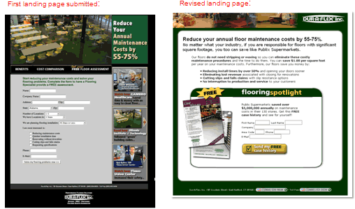
Page Revision 1: Dur-A-Flex
Jimmy Ellis: I’d like to focus first on the page on the left and all the distractions there. The big graphic at the top doesn’t state or support the value proposition—in fact, by looking at it, it’s confusing to see exactly what this company does. Then, when they do state the value proposition, you miss it because your eye is drawn to the long form underneath. Finally, the three images on the right are too powerful and when I say “powerful,” I mean that they distract your eye from the page’s real objective.
Now the page on the right has a real headline that’s easy to see. Even more important, there’s a headline and a sub-headline. This page is a great example of the “vertical flow” we’re always talking about. Now the “free” graphic is emphasized so I know that I can get something free whether or not the form is actually shorter. It looks shorter and that’s always a good thing.
Aaron Rosenthal: The thing I’d really like to draw attention to is the fact that we’re looking at almost identical headlines but you simply couldn’t see the one on the left. This page has done a terrific job of simplifying the eyepath.
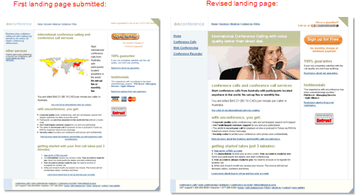
Page Revision 2: On Conference
Aaron Rosenthal: As I’m looking for changes one thing I’m noticing is that while there are changes in headline and button style, the information has not changed all that much. One change that’s mentioned is the idea that through On Conference you can get better voice quality than direct dial but there’s a more effective statement down below. If they really can get started in three minutes, then they need a button or a headline that will help them get started. Notice that by moving the call to action button to the upper right, you’ve taken it out of the customer’s eyepath. So when they get to the bottom of the page, they’re confused about how they’ll take action.
Jimmy Ellis: Voice quality is pretty hard to prove. But if your system is really easy to use, support that with quantitative copy. I have to say I don’t approve of the change to the headline: the white print on green is hard to read, and even Aaron was having a hard time reading it. I definitely think that the image on the right is better but I’d like to see if there’s some way to combine it with the image of the map.
Aaron Rosenthal: One danger in your current graphic is that the woman is holding a landline phone and that doesn’t immediately suggest conference calling. Also, if the goal of this page is lead-gen, consider that you need to start collecting that information on the first page.
Overall, the live optimizations of the revised pages focused on streamlining and simplicity. Participants were encouraged to optimize their value propositions through:
- quantitative evidence
- vertical flow
- relevant graphics
- focused calls to action
The live optimization continued with an exploration of three newly submitted landing pages.
Live Optimization Continued:
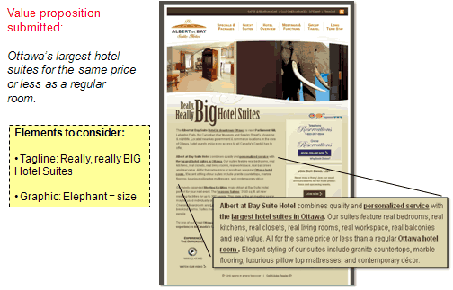
Example 1: Albert-at-Bay
Aaron Rosenthal: Your value proposition is great—it’s really starting to get somewhere but you really don’t communicate it until the second paragraph. However, I find both your graphics and your tagline confusing. Is “Really, really BIG” serious or is it a joke? And what is that elephant doing in my hotel room?
Jimmy Ellis: I agree completely. I’d much rather see information like “our suites are 40% larger” or “27% less cost” or a chart that compares square footage. While I really like your second paragraph, it would be great to break that paragraph into bullets and put thumbnails into each architectural feature mentioned in your copy so that people can really see what you’re talking about.
Example 2: U-Store-It
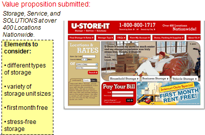
Jimmy Ellis: The first thing I see about this page is that there is no value proposition unless it’s that you’ve got over 400 locations nationwide. But that’s not a value proposition because there are literally storage facilities everywhere. This page needs a lot of help. It’s got attractive images but it doesn’t explain much to customers or help them get started unless they type in their zip code. Fortunately, the name of the company does a good job of communicating its purpose.
Some of my recommendations include using an image that doesn’t have a hard-to-read testimonial. And, unless price is your value proposition, you’ve got to do something to get your prospects interested in using your service before they start looking up locations and rates. In my opinion, this site really needs to start from scratch.
Aaron Rosenthal: One important thing to notice here is that you have all these boxes, or ad tiles, trying to communicate all these different messages. But what happens is that these tiles end up competing with one another. On one page, you’ve got location rates; pay your bills; first month free. It’s information overload and you’re not guiding anyone.
I don’t mean to offend anyone but you’re really doing a poor job of getting into your customer’s thought process. But, please remember, this gives you that much more opportunity to test, get improvements, and ultimately increase your revenue.
Example 3: Montessori in Redlands
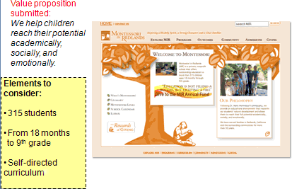
Jimmy Ellis: The main problem with your value proposition is that there’s no proof, no credibility in that statement. If I’m a parent looking for a school for my kid, I need you to show me proof that a Montessori education will help my child excel. If there are studies showing that Montessori kids do better in college, need less remedial education, or excel in relationships, this is the time to reference those studies. And as a fundamental rule, don’t say “Welcome” on your homepage, say “why” a prospect can benefit from being here.
Aaron Rosenthal: Right now you’re using a print advertisement at your web page. You need to focus more on the worth of what you’re trying to communicate to a customer than using pretty graphics and background images to try and communicate that message.
Value Proposition: Qualitative vs. Quantitative
Many of the examples reviewed shared a common theme: the expression of their value proposition was not specific enough.
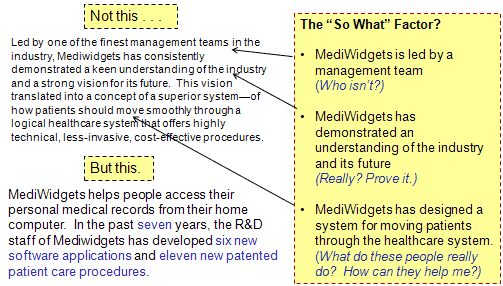
One problem is that in efforts to keep value propositions brief, vague terms replace the truly unique or valuable aspects of a company, its products or offers. Because marketers are intimately familiar with their products or services, those generic descriptions seem perfectly clear. Or, certain characteristics of the company, product or service that are most valuable to customers are overlooked.
An example from Dr. Flint McGlaughlin’s paper, “Transparent Marketing,” details how to keep asking “So what?” to transform a value proposition from general and unremarkable to unique and intriguing. In the paper, Dr. McLaughlin used this approach to revise the value proposition for a hypothetical company called Mediwidgets.
Replacing vague modifiers with specific, quantitative facts makes the value proposition shorter, easier to grasp, and more attractive to potential customers.
To avoid falling into the trap of qualitative language, beware of overused words such as:
- best
- leading
- unique
- finest
- highest quality
- only
- cutting-edge
- cost-effective
- superior
- innovative
- solutions
If you find similar buzzwords and hollow superlatives in your copy, revise it with an emphasis on specific, quantifiable details. And if coming up with those specifics seems impossible, let your customers do the bragging for you with genuine testimonials and third-party credibility indicators (awards, reviews, seals).
After those steps, if you’re still struggling to create a powerful value proposition, it’s time to take a hard look at the product, service, offer or even your business model; a more intensive fix may be in order.
- Optimizing your value proposition is a cyclical process that involves identifying, expressing, and testing/refining.
- Look for the “buried treasure” on your site: Find hidden elements in your copy that will strengthen your value proposition.
- Use tools like the assessment matrix and PPC micro-tests to evaluate your offers and re-craft them as needed.
- Refine your value proposition until you can articulate it in a single, instantly credible sentence.
- Focus on quantitative expression over qualitative.
Related Marketing Experiments Reports
- Optimizing your value proposition — resources for today’s clinic and beyond
- Landing Page Optimization
- Value Proposition Showdown: Your Company vs. Your Product or Service
- Time for Some Spring Cleaning on That Landing Page
- Austin McCraw’s Marketingexperiments Guest Blog Spot
- In Search of a Value Proposition
- Optimizing eCommerce Websites
- MarketingExperiments Webinar
- MarketingExperiments Webinar Pt. 2
Literature Review
As part of our research, we have prepared a review of the best Internet
resources on this topic. Rating System
These sites were rated for usefulness and clarity, but alas, the rating
is purely subjective.
* = Decent | ** = Good | *** = Excellent | **** = Indispensable
- Value Propositions: Fast Company ****
- Value Proposition–Social Edge ****
- Summit Insight–Your Unique Value Proposition ****
- Insight Center–Customer Value Propositions-Portfolio.com ***
- Customer Think Blog ***
- VP: Jill Konrath: The Sideroad ***
- Remarkable Communication Blog ***
- Seven Building Blocks to a Unique Value Proposition **
- Bringing the Value Back Into Value Propositions **
- Top Templates: Value Propositions **
- Growing, Changing, Learning, Creating: The Value Propositions of Blogs *
- Survey Example Value Proposition *
Credits
Managing Editor
Hunter Boyle
Copy Editor
Frank Green
Writer
Anna Jacobson
Contributor(s)
Flint McGlaughlin
Bob Kemper
Production
Mel Harris
Austin McCraw
Cliff Rainer
Amanda Mehlhoff


